Tampilkan postingan dengan label beach home interiors. Tampilkan semua postingan

Rabu, 17 Juli 2013

Outtakes: A Mount Maunganui marvel by Evan Mayo

Mount Maunganui is one of New Zealand's favourite summer destinations, but when Heather Coyne and Mark Winter asked Hamilton-based architect Evan Mayo of Architecture Bureau to design them a holiday home there, they never envisaged they'd end up moving there permanently. 

It's a credit to Evan's smart design that they did so. Heather and Mark found the single-level holiday house he created so pleasing that they decided to move there full-time. The main house, beautifully photographed by Florence Noble, features a handsome, compact, three-bedroom structure with high ceilings made from hoop-line plywood. Importantly, the property's original cottage was retained on the site, and now doubles as a home office and spare bedroom. It's visible in the right of the photo below, and is one of the few original dwellings remaining on the Mount Maunganui beachfront promenade.

The tyre-swing that hangs from the pohutukawa down the drive and the central decking between the original property and the modern building (below) perfectly respond to the brief of this holiday home being "a place for the kids to grow up" says Mark.


The view from the kitchen cleverly looks over the home's living and decking area so Heather and Mark can keep an eye on their grandchildren at play (below) and enjoy the sunshine when they feel like it.


The extended eave over the deck offers shade and shelter (below), while the deck integrates well with the surrounding landscaping, which expertly manages the transition from the lower-level carport to the home itself. Inside, clerestory windows on the home's western elevation allow good ventilation and afternoon light.


The living area features the Focus 'Ergofocus' fireplace designed by Dominique Imbert, which warms the area on cold winter nights. The pendant lights above the kitchen bench were purchased on TradeMe.
 

The shot below shows the connection between the open-plan living space and main bedroom and en suite. Two additional smaller bedrooms are tucked into the home's western side, but when no visitors are staying, the home feels like a simple apartment for Heather and Mark.


The retention of the original cottage (below) is a sympathetic masterstroke. On a street where a number of homes look like they're on steroids, Evan's sensitive design retains something of the diminutive age-old scale of this beachside community, as well as providing privacy for Heather and Mark's new home.

  
The following photograph is from just across the road from the house, with Mount Maunganui beach's wild-daisy covered dunes extending into the distance. 
 

Senin, 15 Juli 2013

Outtakes: A beautiful beach getaway by Min Hall

It's that time of year when we start fantasising about taking a break - not an all-action holiday, but something quiet and wintry that mostly involves reading books around a fire. This home by architect Min Hall in Golden Bay seems to fit that description perfectly.

First, the plan, which is interesting in its own right. Min broke the house into modules designed to fit around the trees. There is one living and dining area, another wing for the main bedroom and the third for guests (below). The sea is on the eastern boundary, or right-hand side of the plan.
The photograph below (all these images were taken by Paul McCredie) shows the approach to the house, where cars pull up to the back of the house. Min designed the home's modules to be clad in different materials to break up the bulk of the building even further. Covered walkways connect the home's different parts.


Inside, the house has elegantly simple aesthetics - only two pieces of art feature in the property, so not to distract from its surroundings -  yet there are some unique design elements which define the house.

The box window in the dining area (below) is likened to a museum display and exaggerates the feeling of looking inwards through the forest. A Simon James-designed 'Hawk' table accompanies seating by Marc Zuckerman and a smaller rustic 'Uma' bench by Chad Heays.


Huge folding doors off the living area allow a large panorama of the bay (below).


Perhaps even better is the view from the main bedroom where, at high tide, water gently laps on the shore just a few metres away. This is the kind of thing real holidays are made of - when staying in bed seems like one of the best ways to enjoy the views.


Selasa, 04 Desember 2012

Outtakes: Hut on Sleds by Ken Crosson

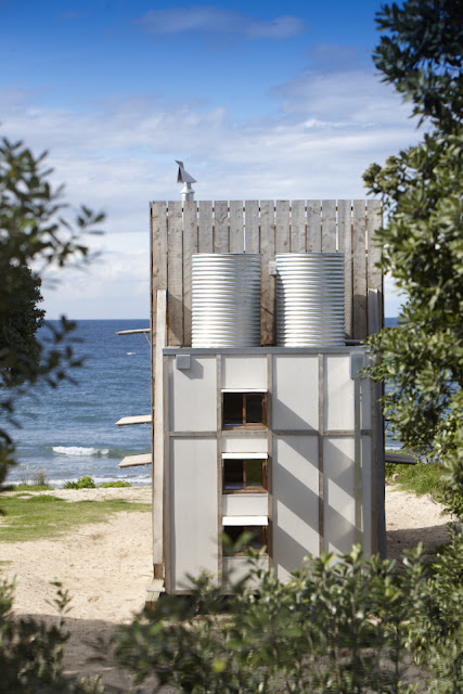
In our April/May issue, we introduced you to a tiny house, "Hut on Sleds" on the Coromandel Peninsula at Whangapoua Beach designed by Ken Crosson(below). This diminutive, charming holiday home was a finalist in our Home of the Year award 2012, and subsequently shortlisted in the World Architecture Festival's awards. It is such a cleverly built and elegant bach that we wanted to show you more of Jackie Meiring's terrific photographs of it. 

"It had to be a de-mountable house," explains Ken, required by the council because it is located within an erosion zone on the Coromandel coast. Measuring a mere 40 square metres, the house rests on two thick wooden 'sleds' that allows it to be dragged anywhere once uncoupled from power and wastewater and untied from the concrete pads beneath the sleds. It lends an entirely different meaning to the idea of moving house.


The bach has been designed to close up against elements: with doors and shutters closed (as in the photo above) it is truly hermetic to rain and wind gusts. But when the sun is shining, the house opens up to let the outside in (below).

Beyond the demands of its setting, the bach had to fit its clients' desires as well. "It was all about examining what was the real essence of a bach versus a beach house," says Ken. "They wanted something small and experiental. It's tiny, so the challenge was to make it as bachy as possible, and not waste any space in doing that."

That's why there's an intentionally enforced proximity imposed on its occupants : a compact front living and kitchen area flows through a rear bunkroom for the owners' three young children, and the main bedroom is up a ladder from the living room, sharing the same view as downstairs through the huge glass doors.


In the main bedroom (above), there are warm shades of macrocarpa joinery and a remarkable attention to storage detail. Downstairs, each of the childrens' beds (below) has their own storage spaces ("secret cubby holes" says Ken), their own lights and windows. The walls themselves double as floor-to-ceiling shelf space that Ken hopes will accumulate the personal histories of the occupants.


The ladder you use to reach the main bedroom also brings you to the roof terrace, which catches rainwater for the gravity tanks behind (below), and affords great views of the beach and the sunsets.


Inside, there are intentional references made by Ken and his clients to the campground, such as the deliberately rudimentary tap and shower fittings. As Ken says: "You know, where you fill your bucket. It's that kind of idea"


To one side, a second entrance to the house via the shower and bathroom, allows occupants to shower straight away after going to the beach (below).


"It's kind of like a tent," says Ken about the bach's structure. "It's dramatic and vertical. The tent flap [the huge macrocarpa front shutter] is that big door that opens up - a big gesture that embraces the view."


Senin, 03 Desember 2012

Our new cover

Our new cover features a photo by Paul McCredie of a holiday home by Assembly Architects at Waipatiki Beach in Hawke's Bay. In the pic architect Louise Wright, who designed the home with her architect husband Justin Wright, relaxes on the window seat. The home is one of seven beautiful summer getaways in this issue, which is on newsstands now. 

You'll note on this cover that we've initiated a little design tweak, cropping the image in a way that we think makes the masthead really pop and adds a greater degree of clarity to the cover (as well as providing a contrast to the dominance of full-bleed images on the newsstand). We're also using a smart new headline font, Eames Century Modern, inspired by the stencils of Charles & Ray Eames and created by US type firm House Industries.

We're really pleased with how this issue has turned out. We hope it provides you with hours of happy summer reading.