We've just made this short web film featuring Nat Cheshire and Emily Priest of Cheshire Architects talking about the design of the gorgeous 'Parison' pendant for Resident, the winner of our furniture and lighting Design Awards 2014. In it, they talk about the design process, the joys of being a designer in New Zealand, and Cheshire Architects' ambitions to "redesign entire cities" and "build whole worlds".
Tampilkan postingan dengan label Cheshire Architects. Tampilkan semua postingan
Tampilkan postingan dengan label Cheshire Architects. Tampilkan semua postingan
Rabu, 11 Juni 2014
Nat Cheshire talks about the design of the beautiful 'Parison' pendant

Selasa, 03 Juni 2014
Presenting NZ's best new furniture in our annual Design Awards (with our new partners Fisher & Paykel).
Every year we're delighted to showcase New Zealand's best new furniture and lighting in our annual Design Awards - and this year, we're delighted to present the finalists and winner to you in conjunction with our new Design Awards partners, Fisher & Paykel.
First, meet the designers in our competition (who you can also see in this issue of the magazine). They are (from left) Nat Cheshire of Cheshire Architects; Nathan Goldsworthy of Goldsworthy; Tim Webber of Tim Webber Design; Simon James of Resident; Nigel Groom and Emma Fox-Derwin of Well-Groomed Fox; and Timothy John of Timothy John Design. They were photographed by Toaki Okano at Auckland's White Studios on May 7.

And now to the objects in our competition. The winner of the 2014 Design Awards is Cheshire Architects for the 'Parison' pendant for Resident (below), an elegant mix of the hand-made and the digital (it's made when a bubble of layered molten glass is mouth-blown into a computer-cut mould of water-soaked cherrywood). The pendant has already debuted at the Milan furniture fair as part of the Resident collection, and we're delighted to feature it here.

And here are our other finalists, in no particular order: first, the 'Pi' table (below) by Paris-based designer Roderick Fry, an ingeniously simple trestle leg system that flat-packs for shipping but holds a range of table tops with perfect stability.

Nathan Goldsworthy's beautiful 'Ballet' chairs and 'Ballerina' tables (below) were produced as part of a collaboration with Backhouse Interiors and Designworks. The chairs and table are crafted from laminated ash, and the chairs are upholstered in wool.

Emma Fox-Derwin and Nigel Groom of Wellington's Well-Groomed Fox created the handsome 'Notch' pendant lights (below), which have a raw, matte depth thanks to their colour being part of the ceramic rather than a glaze applied later.

Designer Timothy John created the 'Handmade' range (below) - which includes the 'Bowler' light, 'Splay' table and 'Nordic' chair - for Paper Plane, the design store he co-owns in Mount Maunganui. All the designs are hand-crafted by Nigel Cotterill. The chair and light are made from solid American ash, and the table is available in ash or laminate versions.

Auckland-based Tim Webber created the 'Duffle' ottoman, a sturdy piece of furniture that references the classic bag. It's upholstered in wool with a simple rope drawstring.

Last but certainly not least is Simon James' 'Pick Up Sticks' chair for Resident, with a solid oak frame and detachable, wool-upholstered component, allowing retailers to stock the frames and the wool seats to be made to order.

A huge thank you from us to all the designers who entered, and congratulations to the team at Cheshire Architects and the other finalists. We're also delighted at the support Fisher & Paykel are giving to New Zealand design by supporting our awards programme.
Our shoot was photographed by Toaki Okano, and styled by Kendyl Middelbeek and Samantha Totty. You can read more details about the entrants in our special winter issue of the magazine.
First, meet the designers in our competition (who you can also see in this issue of the magazine). They are (from left) Nat Cheshire of Cheshire Architects; Nathan Goldsworthy of Goldsworthy; Tim Webber of Tim Webber Design; Simon James of Resident; Nigel Groom and Emma Fox-Derwin of Well-Groomed Fox; and Timothy John of Timothy John Design. They were photographed by Toaki Okano at Auckland's White Studios on May 7.
And now to the objects in our competition. The winner of the 2014 Design Awards is Cheshire Architects for the 'Parison' pendant for Resident (below), an elegant mix of the hand-made and the digital (it's made when a bubble of layered molten glass is mouth-blown into a computer-cut mould of water-soaked cherrywood). The pendant has already debuted at the Milan furniture fair as part of the Resident collection, and we're delighted to feature it here.
And here are our other finalists, in no particular order: first, the 'Pi' table (below) by Paris-based designer Roderick Fry, an ingeniously simple trestle leg system that flat-packs for shipping but holds a range of table tops with perfect stability.
Nathan Goldsworthy's beautiful 'Ballet' chairs and 'Ballerina' tables (below) were produced as part of a collaboration with Backhouse Interiors and Designworks. The chairs and table are crafted from laminated ash, and the chairs are upholstered in wool.
Emma Fox-Derwin and Nigel Groom of Wellington's Well-Groomed Fox created the handsome 'Notch' pendant lights (below), which have a raw, matte depth thanks to their colour being part of the ceramic rather than a glaze applied later.
Designer Timothy John created the 'Handmade' range (below) - which includes the 'Bowler' light, 'Splay' table and 'Nordic' chair - for Paper Plane, the design store he co-owns in Mount Maunganui. All the designs are hand-crafted by Nigel Cotterill. The chair and light are made from solid American ash, and the table is available in ash or laminate versions.
Auckland-based Tim Webber created the 'Duffle' ottoman, a sturdy piece of furniture that references the classic bag. It's upholstered in wool with a simple rope drawstring.
Last but certainly not least is Simon James' 'Pick Up Sticks' chair for Resident, with a solid oak frame and detachable, wool-upholstered component, allowing retailers to stock the frames and the wool seats to be made to order.
A huge thank you from us to all the designers who entered, and congratulations to the team at Cheshire Architects and the other finalists. We're also delighted at the support Fisher & Paykel are giving to New Zealand design by supporting our awards programme.
Our shoot was photographed by Toaki Okano, and styled by Kendyl Middelbeek and Samantha Totty. You can read more details about the entrants in our special winter issue of the magazine.
Kamis, 03 April 2014
Amanda Levete on the Home of the Year
Given all the attention our Home of the Year is getting, we thought many of you might be interested in hearing some of the thinking behind the jury's decisions.
The Home of the Year jury was made up of HOME editor Jeremy Hansen, Gary Lawson of four-time Home of the Year winners Stevens Lawson Architects, and Stirling Prize-winning London architect Amanda Levete.
Here, Jeremy talks to Amanda about the judging process. This interview was conducted in mid-March, soon after judging of the Home of the Year was complete.
 |
| Architect Amanda Levete. Photo: Peter Guenzel. |
JEREMY HANSEN Let’s start by talking about the winning project: Eyrie, the black cabins by Nat Cheshire of Cheshire Architects.
AMANDA LEVETE That project was very finely tuned, such a poetic response to its site. It was a complete merging of idea and form. And there’s a narrative behind it that’s as poetic as its realisation. The idea that an architect would negotiate with planners to allow a smaller and much more modest footprint on the site is a fantastic inversion of expectations: it captures the mood of the world right now by demonstrating a greater respect for modesty and a reining in of consumerism. It shows how much you can do with so little and still hold such resonance.
The landscape it’s situated in was not the most beautiful or most dramatic of the sites we saw – far from it – but it had a sensibility of its own. You could sense this through the success of the dialogue between the client and the architect. It felt like there was a complete synergy between architect and client, and that is quite rare. It feels like the relationship with the client pushed the architect to go beyond his repertoire and explore ideas and an attitude that perhaps hadn’t been expressed in his work before. You need that input from a client, you need that challenge – and you need that energy and inspiration to make your work better. It’s those kind of relationships and moments that push an architect to develop and become great.
The cabins were beautifully detailed in a very simple way but every move, every line held the idea of the house. The tiny brass recessed kitchen area, which was like a little jewel in this simple black container, lifted it from being prosaic to something exceptional. The cabinets around the kitchen, which used a crude black-painted form-board, had chamfered edges that revealed the colour of the ply behind it, a tiny shadow line that, because the space was black, had a lustre almost like there was a light behind it. And what was so revealing about that space was that it was a black interior and black exterior but it didn’t feel oppressive. You were drawn into the space by the light and felt uplifted and serene and at one with the world and with nature.
 |
| The Home of the Year 2014, designed by Nat Cheshire of Cheshire Architects. Photo: Darryl Ward. |
JEREMY HANSEN What made the other homes worthy of inclusion? Let’s go from north to south, and start with the house by Herbst Architects.
AMANDA LEVETE This house expressed very clearly how the forces of nature can drive design, with a clever layering of openings between indoor and outdoor spaces. There was a very strong relationship between a deep gabion wall and the passage between the bedrooms and the main spaces of the house, an outside but protected area that reinforced it as a beach house, so whatever the weather and time of year, you have to go outside to get inside, and that was very charming.
 |
| The Castle Rock House by Herbst Architects. Photo: Patrick Reynolds. |
JEREMY HANSEN On Waiheke Island we visited a home by Wendy Shacklock. What did you enjoy about that?
AMANDA LEVETE This was an incredibly difficult site and a huge amount of thought had gone into exploring ways in which you could liberate it. That’s been achieved in a way that appears effortless, thanks to much of the site engineering being invisible – but it was far from straightforward. There was also a delicacy about the use of materials and the contrast between the solidity and brutality of the concrete wall and the openness of the elevations looking down at the water. The clients wanted the house to feel like a nest, and it did feel very protective and precarious at the same time.
 |
| Te Kohanga, a home on Waiheke Island designed by Wendy Shacklock in association with Paul Clarke. Photo: Samuel Hartnett. |
JEREMY HANSEN How about the small house by Andrew Simpson?
AMANDA LEVETE This was a studio house, just 50 square metres in which every little square foot was accounted for and exploited. There was a wonderful, huge opening up of a view on a very difficult site. What I loved was the ambition and endeavour that was invested into such a complicated site. That endeavour was palpable and real – the architect built much of the interior – and it shows again how much you can achieve with a modest budget, which is always refreshing.
 |
| The Nine Tsubo House by Andrew Simpson of Wiredog Architecture. Photo: Paul McCredie. |
JEREMY HANSEN On Banks Peninsula, we visited the Scrubby Bay Farmhouse by Pattersons.
AMANDA LEVETE I found this house incredibly beautiful. Proportionally there was a real kind of magic about the delicacy of these barn-like forms that just slipped one in front of the other in a strong sectional relationship sited in a completely spectacular bay. The plan of the house was understated and restrained, and that restraint was very powerful when matched by such a spectacular backdrop. The house also made beautiful use of wood, with a subtle scent of the macrocarpa cladding inside that was just magic for me.
 |
| The Scrubby Bay Farmhouse by Pattersons. Photo: Simon Devitt |
JEREMY HANSEN We saw homes on beautiful sites, but the suburban house by LO'CA in Wanaka was different.
AMANDA LEVETE This is a house for a retired couple with a brief that was far from glamorous, but the architects managed to lift it by creating a kind of respect for the span of a couple’s life, and I was very touched by that. It wasn’t just the clever planning but the way in which the clients’ lives – their past as well as their future and the present – were mapped into the planning; I’ve never seen that done before. It made me think how important houses are as containers for your life and your history. Some of the houses we saw had an absence of the soul of the owners, and a house needs soul. This one had it.
 |
| The Lovell House by Tim Lovell and Ana O'Connell of Lovell O'Connell Architects. Photo: Patrick Reynolds. |
JEREMY HANSEN This is your first visit to New Zealand. What are your impressions of the country's architecture after a week here?
AMANDA LEVETE It’s clear that the bach is a powerful genre, and we’ve seen it interpreted differently in extraordinary settings that are very particular to New Zealand. There is an incredible and inventive use of woods, which has been inspiring to me, and makes me want to explore that in our own work. But I worry that there’s a kind of complacency in New Zealand’s architecture. I have seen some of the most spectacular sites in the world on this trip and some of the most extraordinary pieces of landscape – I don’t think I’ll ever see anything more beautiful. With that goes a huge responsibility to respond with an ambition that matches that drama and the beauty of the location. That responsibility is sometimes taken too much for granted. I think architects need to remind themselves what a privilege it is to design in a piece of nature that is unsurpassable.
Clients, too, need to have that same sense of ambition and responsibility in selecting their architect and in their own briefs. It’s not just about designing a house. You have to respond to the magnitude and power of nature at its most beautiful. Houses are relatively modest in scale but historically they have defined an architectural era, and not enough architects here feel that sense of potential. Architecture here is quite self-referential and it shouldn’t be, because what we’ve seen in this last week is a fantastic abundance of talent and inventiveness and clever thinking. Architects in New Zealand should be more ambitious in terms of their place internationally – you have a great tradition of house design that could be defining and having an influence on the rest of the world.
JEREMY HANSEN Lastly, do you have any thoughts about awards like this in general?
AMANDA LEVETE The Home of the Year award is important because it’s not just about applauding excellence; it’s about marking turning points in architects’ careers. The purpose of awards is to recognise talent and to lift the standards and advance the debate. The cross-section of projects we’ve selected for this, the Home of the Year issue, is testament to all of that.
Amanda Levete travelled to New Zealand thanks to the support of Altherm Window Systems, our Home of the Year sponsor.
Selasa, 01 April 2014
Home of the the 2014 - the winner!
Congratulations to Nat Cheshire of Cheshire Architects, who designed Eyrie, the twin cabins on an inlet of the Kaipara Harbour that have won our 19th Home of the Year award. Here's our new cover, featuring a photograph by Jeremy Toth.
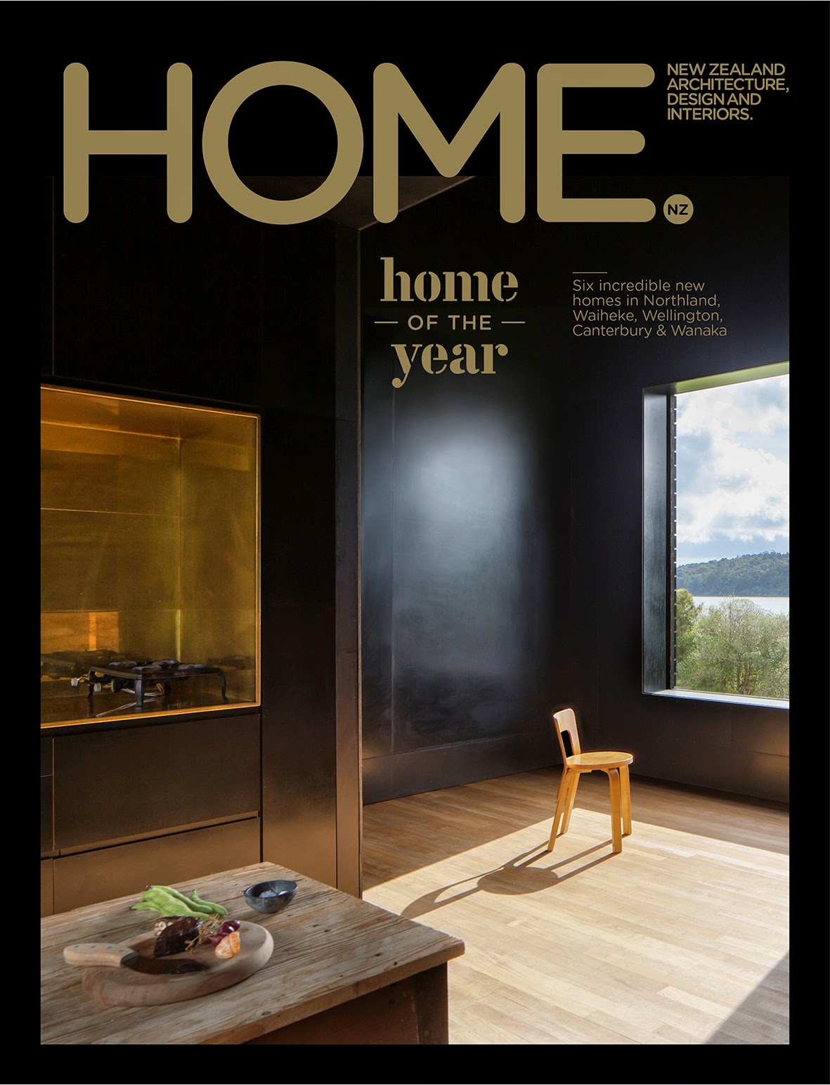
Jeremy Toth also shot this fantastic short web film of the winning homes for us - watch it here, and enjoy! Thanks, as always, to our sponsors, Altherm Window Systems.
Home Of The Year 2014 from Jeremy Toth on Vimeo.
Jeremy Toth also shot this fantastic short web film of the winning homes for us - watch it here, and enjoy! Thanks, as always, to our sponsors, Altherm Window Systems.
Home Of The Year 2014 from Jeremy Toth on Vimeo.
Home of the Year 2014 - the finalists
Tonight's the night we announce our 19th annual Home of the Year award. We're delighted to present the six finalists for the award for you here.
As always, the winning architects will received a $15,000 first prize, thanks to our award sponsors Altherm Window Systems.
The award was judged by our Home of the Year jury - HOME editor Jeremy Hansen, Gary Lawson of Auckland's Stevens Lawson Architects, and Stirling Prize-winning London architect Amanda Levete - who visited all the shortlisted homes in early March to make their selection of the winner and finalists.
The winner and all the finalists will be in our Home of the Year issue, on newsstands from Thursday April 3. And you can check back here at 7.30pm this evening to see our short web film of the winning home.
Here are the finalists, from north to south:

The Castle Rock House (above) is a holiday home at Whangarei Heads by Herbst Architects, who designed our Home of the Year 2012 winner. The photograph is by Patrick Reynolds.

Eyrie by Nat Cheshire of Cheshire Architects is a pair of almost-identical cabins (above) on an inlet of the Kaipara Harbour. The photograph is by Darryl Ward.

This Waiheke Island home (above) was designed by Wendy Shacklock Architects in association with Paul Clarke. The photograph is by Samuel Hartnett.

This 50-square-metre home (above) in Wellington was designed by Andrew Simpson of Wiredog Architecture for himself and his partner, Krysty Peebles. The photograph is by Paul McCredie.

This farmhouse (above) on an isolated bay on Banks Peninsula was designed by Pattersons, and photographed by Simon Devitt.

As always, the winning architects will received a $15,000 first prize, thanks to our award sponsors Altherm Window Systems.
The award was judged by our Home of the Year jury - HOME editor Jeremy Hansen, Gary Lawson of Auckland's Stevens Lawson Architects, and Stirling Prize-winning London architect Amanda Levete - who visited all the shortlisted homes in early March to make their selection of the winner and finalists.
The winner and all the finalists will be in our Home of the Year issue, on newsstands from Thursday April 3. And you can check back here at 7.30pm this evening to see our short web film of the winning home.
Here are the finalists, from north to south:
The Castle Rock House (above) is a holiday home at Whangarei Heads by Herbst Architects, who designed our Home of the Year 2012 winner. The photograph is by Patrick Reynolds.
Eyrie by Nat Cheshire of Cheshire Architects is a pair of almost-identical cabins (above) on an inlet of the Kaipara Harbour. The photograph is by Darryl Ward.
This Waiheke Island home (above) was designed by Wendy Shacklock Architects in association with Paul Clarke. The photograph is by Samuel Hartnett.
This 50-square-metre home (above) in Wellington was designed by Andrew Simpson of Wiredog Architecture for himself and his partner, Krysty Peebles. The photograph is by Paul McCredie.
And this home in Wanaka for a retired couple was designed by Tim Lovell and Ana O'Connell of Lovell O'Connell Architects.
We're delighted with the inventiveness and variety of this year's finalists. Remember to check out much more coverage of all these homes in our Home of the Year issue.
Senin, 29 Juli 2013
We like: Milse's sweet treats at Auckland's Britomart
We like the sublime, sweet offerings of dessert restaurant and patisserie Milse (pronounced 'Mil-say', and is Gaelic for 'sweet') as much as we like its dramatic interior.

The cocoon-like space in Auckland's Britomart opened recently and supplies desserts to neighbouring Ortolana restaurant as well as hosting diners at tables of its own, and offering takeout.
The space was designed by Cheshire Architects. HOME editor Jeremy Hansen spoke to Nat Cheshire about the design, and to Milse's executive pastry chef Brian Campbell about the amazing food. These photographs are by David Straight.


The cocoon-like space in Auckland's Britomart opened recently and supplies desserts to neighbouring Ortolana restaurant as well as hosting diners at tables of its own, and offering takeout.
The space was designed by Cheshire Architects. HOME editor Jeremy Hansen spoke to Nat Cheshire about the design, and to Milse's executive pastry chef Brian Campbell about the amazing food. These photographs are by David Straight.

HOME What was your brief for the space, and how did you go about filling it?
NAT CHESHIRE, CHESHIRE ARCHITECTS Within this left-over back-alley space we needed to offer an immersive and transformative experience, shaping spaces around some of the most ambitious dessert cooking in the country. We were inspired by the Arabian history of dessert-making to create an interior that folds together the crystalline structure of sugars and the delicate tracery of carved wooden moucharaby panels.

HOME How does it feel to be in the space?
NAT CHESHIRE The goal is a world of quiet delight within a chaotic left-over geometry surrounded by service lanes and delivery trucks outside. Milse has a cave-like intensity within the quiet complexity of its filigree surface. We hope this means it feels like another world entirely.

HOME I remember people eating their feelings at Death by Chocolate in the 80s. How is Milse different from the dessert restaurants of that era?
BRIAN CAMPBELL, EXECUTIVE PASTRY CHEF I think people are now eating a lot more casually – it’s the norm to restaurant-hop. Our approach is to focus on the best of seasonal products as well as showcasing premium ingredients such as chocolate and spices to give people an amazing dessert experience, whether they’re eating in or taking away.
HOME What’s your favourite thing on the menu at the moment?
BRIAN CAMPBELL I like the passionfruit and apple salted caramels.
NAT CHESHIRE I am trying to eat my way through everything, one hemispherical salted caramel gelato cake at a time.Milse is at 27 Tyler Street, Britomart, Auckland, ph 09 368 9487 (no reservations accepted).

Jumat, 04 Juni 2010
Our new cover
 Here's our June/July cover - a photograph of the lodge at Mountain Landing designed by Pip Cheshire. The photograph is by Patrick Reynolds. We hope we've captured a warm winter mood that will seduce thousands of potential readers into purchasing this issue. For any of you fretting about text legibility, the actual magazine features a more vivid fluoro orange that speaks much more loudly than this CMYK version.
The new issue is on newsstands from June 7.
Senin, 24 Mei 2010
Mountain Landing sketches
Posting the previous item made us think this was also a good opportunity to publish some of Pip Cheshire's early sketches of the house at Mountain Landing. You can see from these why, in the era of the digital rendering, a good drawing still has an unbeatable allure. 


Cheshire Architects at Northland's Mountain Landing
A sneak preview from our June/July issue, which will be on newsstands on June 7. In it, Pip Cheshire, the designer of this lodge/getaway at Mountain Landing in the Bay of Islands, ponders the question of bigness in residential architecture, and the consequent fear of botching a beautiful landscape with an architectural intervention. Here's an image of the lodge he designed, photographed by Patrick Reynolds - as you can see, the landscape around it is extraordinary and, in our opinion, the house is a suitably strong but respectful presence in it:

Mountain Landing is a private subdivision at the northern end of the Bay of Islands. Once a run-down farm, the developers have invested heavily in the creation of wetlands and vast new planted areas. This is a view of the house from down at the bay - it's one of the first homes to be built in the development.
 And here's a view of the bay from the home's terrace:

Mountain Landing is a private subdivision at the northern end of the Bay of Islands. Once a run-down farm, the developers have invested heavily in the creation of wetlands and vast new planted areas. This is a view of the house from down at the bay - it's one of the first homes to be built in the development.
 And here's a view of the bay from the home's terrace:
In the magazine, we ask Pip if the prospect of building on such an amazing site was intimidating.
"Yes," he says. "The nervousness here stems from two aspects, that I might stuff up a great opportunity and a nice paddock and, more importantly, that the site is so loaded - high landscape and heritage values - that the building couldn’t blink, it needed to be strong without dominating."
"I think that Murcutt line of touching the earth lightly is great and certainly fits
You can read the full Q+A with Pip and the story he's written about the property in our next issue (it isn't often that architects are also authors - in Pip's case, his recent book Architecture Uncooked - so we took the opportunity to commission him to write about his own project for this issue). Keep an eye out for it on newsstands soon.
Senin, 01 Februari 2010
Our cover house - outtakes
Now's a good time to show you some of the outtakes from the art-filled Auckland penthouse on our February/March 'Art Houses' cover. As usual, there were a number of great shots by Jeremy Toth that we couldn't fit into our layouts, so it's our pleasure to show them (and the artworks they show) here. The owners of the penthouse are generous philanthropists in the art world and, as you'll see here, have a remarkable collection of their own.
In this shot, photographs by Tacita Dean at left, and a sculpture by London-based New Zealand sculptor Francis Upritchard at right.
 Below this work by Gordon Walters is a table designed by Nat Cheshire of Cheshire Architects (who also designed the penthouse space as a whole) that appears to miraculously float, thanks to the support structure cleverly concealed within it. The bowl is by Gavin Chilcott:
 Here's a view of the hearth that Nat designed that we didn't get to show in its full glory in the layout, a faceted concrete creation. The artwork is by Andy Warhol.

 In the guest bedroom, a chair by Donald Judd and an artwork by Gordon Walters:

In this shot, photographs by Tacita Dean at left, and a sculpture by London-based New Zealand sculptor Francis Upritchard at right.
 Below this work by Gordon Walters is a table designed by Nat Cheshire of Cheshire Architects (who also designed the penthouse space as a whole) that appears to miraculously float, thanks to the support structure cleverly concealed within it. The bowl is by Gavin Chilcott:
 Here's a view of the hearth that Nat designed that we didn't get to show in its full glory in the layout, a faceted concrete creation. The artwork is by Andy Warhol.
Here's a view of the main living space, with its clerestory window, loggia with leafy views, and an artwork by Richard Killeen in the top right of the picture (the orange work at left is by James Ross):
 In the guest bedroom, a chair by Donald Judd and an artwork by Gordon Walters:
The main entrance (guests arrive in the elevator) features a neon work by Martin Creed and artworks by Tacita Dean:

And finally, this glimpse to the bathroom from the master bedroom shows two works by Gretchen Albrecht: the canvas at right, and a mosaic she designed for the bathroom:


And finally, this glimpse to the bathroom from the master bedroom shows two works by Gretchen Albrecht: the canvas at right, and a mosaic she designed for the bathroom:

Rabu, 27 Januari 2010
Our February/March cover
Here's our new cover, which will be on newsstands February 1. This is our annual 'Art Houses' issue; the cover image was taken by photographer Jeremy Toth in an Auckland penthouse with an extraordinary art collection (the penthouse was designed by Cheshire Architects).


The skull artworks are by Andy Warhol, while the koru work in the background is by Gordon Walters. The sculpture on the hearth is by Francis Upritchard, and the carvings in the background are 19th-century ancestral protection figures from Belu, Timor.
Also in this issue: we visit artist Judy Millar's windswept home and studio (designed by Richard Priest) on a dramatic clifftop west of Auckland, Sarah Maxey's 1980s Wellington cottage by Roger Walker, a vineyard home in Hawkes Bay by Hillery Priest Architects, and some beautiful marae on the Mahia Peninsula, among many other things. We'll post outtakes from some of these shoots over the coming weeks.
Sarah Maxey's house will be featured on TV3's Sunrise tomorrow morning at about 8.40pm. We'll also post the link to that footage once it's available online.
Langganan:
Postingan (Atom)