Minggu, 09 Desember 2012

NZIA Wellington architecture awards

Our apologies - we started out diligently posting the results of the regional NZ Institute of Architects awards, but what with our recent print deadline and a few blog image-capacity issues, we've fallen behind. In the spirit of being better late than never, we now present to you the winners of the NZ Institute of Architects Wellington Architecture Awards, in no particular order. (The New Zealand Architecture Awards are selected from the regional categories and awarded in the first half of next year). 

The first winner (in the Public Architecture category) is the ASB Sports Centre in Kilbirnie (below), designed by Tennent + Brown. The photo is by Paul McCredie.


McKenzie Higham Architecture picked up awards in the Sustainable Architecture and  Education categories for their work at Amesbury School (below). The photo is by Kate Whitley. 


Warren & Mahoney's refurbishment of the BRANZ building in Porirua (below) also picked up a Sustainable Architecture award and an award in the Commercial category. Photo by Paul McCredie.


The Carteron Events Centre (below) by Opus Architecture picked up a Public Architecture Award. Photo by Mike Heyden.


The refurbishment of the Chevening Apartment Building in Kelburn (below) won a Heritage award for Studio of Pacific Architecture. Photo by Patrick Reynolds.


In the housing category, Tennent + Brown picked up an award for this house (below) overlooking Cook Strait in Island Bay. Photo by Paul McCredie.  


Studio of Pacific Architecture also featured among the housing awards with this home (below) in Eastbourne, photographed by Patrick Reynolds. 


The new(ish) bar and cinemas on the lower level of the Embassy Theatre (below) won a Heritage award for Designgroup Stapleton Elliott and Indyk Architects. Photo by Paul McCredie. 


The Kumutoto Toilets at North Queens Wharf (below) won a Public Architecture award for Studio Pacific Architects.  


This holiday home at Paekakariki (below, which many of you will recognise from our October/November issue) won a Housing award for Atelierworkshop. Photo by John Girdlestone.


The Maidstone Intermediate School Information Centre (below) by Jasmax won an award in the Education category. Photo by Paul McCredie.


Architect James Fenton's studio (below) in front of his home in the suburb of Northland won an award in the Small Project category. Photo by Patrick Reynolds.


This home (below) by Alistair Luke and Ana O'Connell of Jasmax won awards in the Housing and Sustainable Architecture categories. It was also a finalist in our 2012 Home of the Year award. The photo is by Paul McCredie. 


Another Education category winner: the Porirua College redevelopment (below) by Opus Architecture. Photo by Paul McCredie.
 

The Rangimarie house (below) by Architecture FCA won awards in the Housing and Sustainable Architecture categories. Photo by Sarah Gaitanos.

  
The Regent Park Apartments (below), designed by Designgroup Stapleton Elliott for City Housing WCC, also won an award in the Housing category. Photo by Paul McCredie.


Another housing award went to this house at Plimmerton (below) by Middleton & Novak. Photo by Paul McCredie. 


The Soltius headquarters (below) won an Interior Architecture for Herriot + Melhuish. Photo by Paul McCredie.


The development of the Xero headquarters (above and below) won awards in the Heritage and Interior Architecture categories for Studio of Pacific Architecture. Photos by Patrick Reynolds.

Warren & Mahoney and Geyer picked up an award for Interior Architecture for their fit-out of Telecom Central (below). Photo by Paul McCredie.


Architecture + won a Commercial Architecture award for the Telecom Central building (below) in Willis Street. Photo by Paul McCredie. 


The Wellington Fireplace store (below) in Kaiwharawhara won an Interior Architecture award for John Mills Architects. Photo by Paul McCredie.


At Victoria University of Wellington, the refurbishment of the Hugh Mackenzie Building Lecture Theatre (below) won an award in the Education category for Tennent + Brown Architects. Photo by Paul McCredie. 


Back to the Housing category now, where a holiday home by Parsonson Architects (below) that featured in our December/January 2012 issue won an award. Photo by Paul McCredie. 


The Wellington Zoo Hub and Kamalas Pavilion (below) by Assembly Architects won a Public Architecture award. Photo by Mike Heyden.


And, finally, in the Interior Architecture category, Jasmax won an award for their fitout of Z Energy's offices (below). Photo by Tod Wilson.


Christmas greetings

Christmas greetings from us to you - we hope you like our e-card this year, an image art-directed by Katie Lockhart and photographed by Darryl Ward (and laid out here by our senior designer Sarah Conder). 

We don't finish work until the 21st, but we've put this image up on the blog now because we've been finding its serene mood helpful in coping with pre-Christmas chaos. We hope you do, too.  


Selasa, 04 Desember 2012

Outtakes: Hut on Sleds by Ken Crosson

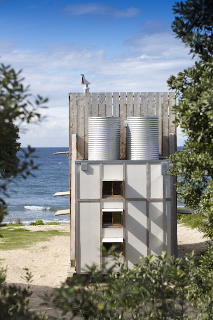
In our April/May issue, we introduced you to a tiny house, "Hut on Sleds" on the Coromandel Peninsula at Whangapoua Beach designed by Ken Crosson(below). This diminutive, charming holiday home was a finalist in our Home of the Year award 2012, and subsequently shortlisted in the World Architecture Festival's awards. It is such a cleverly built and elegant bach that we wanted to show you more of Jackie Meiring's terrific photographs of it. 

"It had to be a de-mountable house," explains Ken, required by the council because it is located within an erosion zone on the Coromandel coast. Measuring a mere 40 square metres, the house rests on two thick wooden 'sleds' that allows it to be dragged anywhere once uncoupled from power and wastewater and untied from the concrete pads beneath the sleds. It lends an entirely different meaning to the idea of moving house.


The bach has been designed to close up against elements: with doors and shutters closed (as in the photo above) it is truly hermetic to rain and wind gusts. But when the sun is shining, the house opens up to let the outside in (below).

Beyond the demands of its setting, the bach had to fit its clients' desires as well. "It was all about examining what was the real essence of a bach versus a beach house," says Ken. "They wanted something small and experiental. It's tiny, so the challenge was to make it as bachy as possible, and not waste any space in doing that."

That's why there's an intentionally enforced proximity imposed on its occupants : a compact front living and kitchen area flows through a rear bunkroom for the owners' three young children, and the main bedroom is up a ladder from the living room, sharing the same view as downstairs through the huge glass doors.


In the main bedroom (above), there are warm shades of macrocarpa joinery and a remarkable attention to storage detail. Downstairs, each of the childrens' beds (below) has their own storage spaces ("secret cubby holes" says Ken), their own lights and windows. The walls themselves double as floor-to-ceiling shelf space that Ken hopes will accumulate the personal histories of the occupants.


The ladder you use to reach the main bedroom also brings you to the roof terrace, which catches rainwater for the gravity tanks behind (below), and affords great views of the beach and the sunsets.


Inside, there are intentional references made by Ken and his clients to the campground, such as the deliberately rudimentary tap and shower fittings. As Ken says: "You know, where you fill your bucket. It's that kind of idea"


To one side, a second entrance to the house via the shower and bathroom, allows occupants to shower straight away after going to the beach (below).


"It's kind of like a tent," says Ken about the bach's structure. "It's dramatic and vertical. The tent flap [the huge macrocarpa front shutter] is that big door that opens up - a big gesture that embraces the view."


Senin, 03 Desember 2012

Our new cover

Our new cover features a photo by Paul McCredie of a holiday home by Assembly Architects at Waipatiki Beach in Hawke's Bay. In the pic architect Louise Wright, who designed the home with her architect husband Justin Wright, relaxes on the window seat. The home is one of seven beautiful summer getaways in this issue, which is on newsstands now. 

You'll note on this cover that we've initiated a little design tweak, cropping the image in a way that we think makes the masthead really pop and adds a greater degree of clarity to the cover (as well as providing a contrast to the dominance of full-bleed images on the newsstand). We're also using a smart new headline font, Eames Century Modern, inspired by the stencils of Charles & Ray Eames and created by US type firm House Industries.

We're really pleased with how this issue has turned out. We hope it provides you with hours of happy summer reading. 


Sponsored post: Karndean Designflooring

Sponsored post 

Choosing your perfect floor is a breeze with Karndean Designflooring’s new interactive Floorstyle viewer


If you’ve ever wondered how your favourite floor would look against a particular wall colour or in a certain room, you’ll love Karndean Designflooring’s new interactive Floorstyle viewer. This brand-new interactive tool allows you to view over 125 designflooring products in various room settings and with different design options, helping you to get a better idea of how your favourite floor will look in a home setting. You can also change the wall or cabinet colours.

So how does it work? It’s easy!

1. Log on. Log on to Floorstyle and select a room.

2. Choose a floor. Keep this floor in-situ and start designing, or select a different product listed on the “Choose a Floor” tab. Your latest sample request will automatically load in Floorstyle

3. Select an installation design. Choose from a variety of laying patterns

4. Choose a colour. Available in most rooms, you can change the colour of the room’s walls and/or cabinets

5. Save, print or share! Request samples, print, save and/or share your best designs via email or Facebook

Feeling creative? Access Karndean Designflooring’s Floorstyle viewer today.

For more information, to find your local Karndean Designflooring retailer or to order your free brochure, visit www.karndean.co.nz or phone 0800 442 101.