Rabu, 22 Agustus 2012

NZ's Architecture van Brandenburg in China

In our current issue, we feature the remarkable story of architect Fred van Brandenburg and his son Damien of Architecture van Brandenburg, who are designing the new Shenzhen headquarters of Marisfrolg, one of China's biggest fashion labels. Below is a shot of the first stage of the building under construction. (It's expected to be completed in three years).


The inspiration for the building's organic forms come from none other than the late Antoni Gaudi, designer of Barcelona's Sagrada Familia cathedral. Fred, who has designed luxury lodges including Huka Lodge and Wharekauhau, decided after seeing Gaudi's buildings that he wanted to make a complete change in the way he designed buildings. "I decided I was going to do sculptural architecture by adapting philosophies [Gaudi] espoused and applying them to contemporary architecture," he says.


Above: An image from a recent advertising campaign by Marisfrolg, using the headquarters' partially completed structure as a backdrop.

The Marisfrolg headquarters job came about after the company's owners visited Fred's office in Lake Hayes, Central Otago, after staying in some of his lodge designs. He told them he was no longer interested in designing that type of building, and they said they would be in touch. About a year and a half later they did so, asking him to come and see their site in Shenzhen in southern China. Fred couldn't remember them, but their seriousness and the scale of the project got his attention: 75,000 square metres, including a catwalk and function area for launching collections, design offices, manufacturing and warehousing and a 50-room boutique hotel for the label's clients. Through their intepreter, Marisfrolg's owners asked for the building to be soaring but unostentatious. "I then realised this was going to be big" said Fred. The final direction was "Design first, budget second."


Above and below: Conceptual models of the Marisfrolg building, inspired by Fred's newfound love of organic forms.
As part of their (very loose) brief, Marisfrolg's owners showed Fred a video of a recent Marisfrolg collection with images of birds in flight and autumnal scenes. "I explained that I was inspired by forms found in nature and it all gelled very quickly," Fred says. Damien had just graduated in architecture from Auckland's Unitec, and moved to Dunedin to work on the project full-time (the duo set up an office there because of its proximity to the "brains trust" of 3D-modelling experts at Otago Polytechnic).

Above: More views of models of the complex in Architecture van Brandenburg's Dunedin office, 
the two colour images photographed by Graham Warman. Damien van Brandenburg is in the shot above.

Fred and Damien have never been told the budget of the project, but nor have their clients ever wavered in their commitment to fulfilling their architect's vision. They're already talking about potential projects with other Chinese developers, but for the moment, Fred says the main focus is on successfully completing the Marisfrolg headquarters. "There are people who are interested in us in China but you can imagine they're reticent and seeing how things pan out [with this project] he says. Once it is, you can easily imagine plenty more attention coming the van Brandenburgs' way.

Senin, 20 Agustus 2012

We like: Wellington's Six Barrel Soda Co.

In our current issue, we visit Six Barrel Soda Co in Wellington's Dixon Street. The cafe was also designed to sell delicious soda made on the spot, in a space masterminded by Matt Smith of Wellington design firm Common. Here's Juliette Wanty's interview with Matt and some more of Russell Kleyn's photographs of one of our favourite new spots in the capital.

Designer Matt Smith of Common

HOME What was the brief for this job?
MATT SMITH We wanted to create a space that could function primarily for the production of soda syrups and secondly as a cafe. The existing space [the former home of Eva Dixon's cafe] had a history of failed cafes and restaurants. We first gutted the space, removing any trace of past ventures, and unified the seating and kitchen areas by removing all internal walls and running the cork-tile floor through the entire space. We also ran a peg rail the length of the space to display items, hold customers' coats and bags, and hang utensils and baskets of fruit in the kitchen. The large central table was positioned so that customers look down the length of the table to the kitchen. A quarter of the table is utilised as the service area, so that customers are engaged with the cocktail-like making and presentation of the sodas.

Customers are able to view the production process in action.


You designed [with Caspian Ievers] the logo and labelling system before embarking on the design of this space. How did you want the space to feel?
Soda bars first conjure up images of Americana, red vinyl, chrome and jukeboxes. We wanted to avoid this and focus on the freshness and quality of the ingredients, and the honesty of the production method. The colours are light and fresh yellow and green. We brought elements of the branding across, most notably Hugo Mathias' illustrations from the labels on the chalkboard wall, while avoiding creating a space that was too branded. The materials are good-quality and durable: cork, american ash and red brick. The almost-primary-school aesthetic of Six Barrel Soda Co - with its cork tiles, chalkboard, peg rail and stamps for labelling - is accidental, but often reminds people of their first encounter with sodas or 'pop'.


Labels are hung on the wooden peg rail that plays both a decorative and functional role in the space.


What has the response been like so far?
People seem to love it. It's been referred to as the most Instagram-able cafe in Wellington!

Six Barrel Soda Co Factory Cafe
Level 1, 33-35 Dixon Street, Wellington
www.sixbarrelsoda.co

See more of Matt Smith's work at
www.commongoods.co.nz


Rabu, 15 Agustus 2012

Prints work by Karen Walker

Fashion designer Karen Walker's latest move is into homeware, specifically a collaboration with the Australian department store Myer to produce a new range of homeware using popular prints. Here's our Q+A with Karen from our current issue, along with some extra images from her homeware range. A word of warning before you get too purchase-ready - while the towels are available in Karen Walker stores, the rest of the range is available only in Myer's Australian stores (and they don't sell online at the moment). 

Karen Walker

HOME You've already developed Karen Walker paint, jewellery and eyewear. Why homeware?
KAREN WALKER We've been interested in developing homeware for some time, and the opportunity came along to create a line in partnership with the right people [Australian department store Myer] at the right time. We've been working with Myer for years, and they approached us to bring our look into homeware.

The images on these mugs also feature in Karen Walker's jewellery collection

How did you choose which prints to use? 
After showing internationally for 20 seasons, we've built up quite an extensive archive of prints, which is where we looked first when creating graphics for bed linen, towels and so on. We made a selection of prints for each category and played around with color and sizing, then sampled what we liked and narrowed it down from there. There are many prints in our archive that we're constantly reworking and reissuing in different ways, whether it be fabric print, fine jewellery or eyewear. Much within our archive has become iconic for us and is reinvented again and again. Homeware gave us another area in which to explore this. We'll be creating new homeware ranges every six months, and they'll always have print and colour as their starting point.


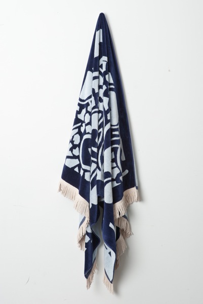
 This range of beach towels will be available in Karen Walker's New Zealand boutiques from spring

When will New Zealand shoppers be able to get their hands on the goods?
The beach towels will be in Karen Walker stores here in spring. The rest of the range can be purchased at Myer's Australian stores from August.


The homeware range also includes these bed linens

Senin, 13 Agustus 2012

Under threat: The Lomas house, Hamilton

Hamiltonians, contact your city councillors! TVNZ is reporting that a 1955 Hamilton home designed by Peter Middleton (that we featured in our October/November 2010 issue) is under threat of demolition.

Paul McCredie did a beautiful job of photographing the building for us (Linda Tyler wrote about the house). It's in a lush garden that the late Heather Lomas, the home's owner, spent decades creating. 


The home won an Enduring Architecture Award from the New Zealand Institute of Architects earlier this year. Middleton was commissioned to design the house by Heather Lomas and her husband Alan. Heather (below) lived in the house until her death in March. The house was later sold to a neighbour by members of Heather's family.


According to the TVNZ report, Waikato heritage consultant Ann McEwan "has called for the Lomas house on Lake Cres to be saved, and wants the Hamilton City Council to bend its district plan to save the 1950s building from demolition." You can read the TVNZ story here 

It's a vexed issue, this. The new owner of the house is, legally, perfectly entitled to demolish it. The Lomas house, like many great modernist buildings, falls into an unprotected grey zone, where these structures are often not considered worthy of heritage protection until it's too late. 

Apart from the fact that we really like it, the Lomas house has genuine historical merit.  It is believed to be Hamilton's first architecturally designed house, and represented a brave early experiment in open-plan living. 


In its citation for the home's Enduring Architecture award, the NZ Institute of Architects said: 

The Lomas House is a fine building and also an inspiring architectural story. Designed for a young family in the 1950s, at a time when materials were rationed but optimism was far more plentiful, the house has gracefully kept pace with that family’s life for more than half a century. Frugal, but never mean with its spatial allocation, the house on its well-positioned site is cleverly and subtly arranged around the framework of a simple grid. Over the years, it has settled into a companionate relationship with the relaxed and unfussy garden. Inhabited beautifully, altered little, and maintained with care, the house is a case study in the lasting benefits of a sympathetic relationship between clients and Architect. 

Much of this inventiveness is evident in the home's careful planning, with level changes and sliding walls creating a greater sense of space in the living area.

In the TVNZ story, Ann McEwan suggests the Hamilton City Council should break its district plan rules to ensure the preservation of the house. The council says it hasn't received any demolition order for the building as yet. 

Outtakes: The Onemana Bach by SGA Architects and Unitec students

Our current issue features a short Q+A with architect Dave Strachan of SGA Architects, talking to him about his work with students at Unitec to design and build social housing in collaboration with Auckland's VisionWest.
This isn't the first time Dave and his students have worked together to build something remarkable - last year he and his team designed and built a thrifty bach at Onemana Beach on the Coromandel Peninsula that was a finalist in our 2012 Home of the Year award. (These photographs are by Simon Devitt).


Dave and his students at Auckland’s Unitec School of Architecture were assisted on this project by architect Marshall Cook and builder John Cocks. As a result, all of these students can claim they will leave university with real-world architectural experience: as well as collaborating on the design of the bach, they built it at the Unitec campus before it was trucked to its site on the Coromandel Peninsula.

This is a good point at which to add context to Dave’s remark in our original article accompanying the Home of the Year issue. In it, we quoted Dave as making an unflattering remark about architects in general, but what he was really trying to say was that there is a perception that architects are regarded this way, and that the way students work with tradespeople in this exercise helps to close the gap between architects and the professionals they collaborate with. Our apologies to Dave for allowing this remark to run in the magazine in a way that made it seem like he was slagging off his own profession, when in reality he holds architects and architecture in the highest esteem. 

 
Above: Andrew Morrison relaxes on the deck in a cane-swing chair while Shiree and their daughters Rubie and Billie hang 
out in the kitchen. Morgan Cronin from Cronin Kitchens advised the students on building the cabinetry.


Above: The living room opens out to decks on both sides. Former Unitec student 
Tim Webber designed the table to match the Morrisons' Ikea chairs.
Part of Dave’s mission in leading this project at Unitec is to encourage productive working relationships and good communication between these students when they graduate and the tradespeople they will work with on future architectural projects. Building the bach was a vital part of this process. The students, Dave says, might say, “oh, we just want a nice flat floor to go through there – well that’s wonderful, but how the hell do you do that, to document it and then build it? That makes it a useful part of architectural education”.

Dave was a builder before he became an architect and has the deepest of respect for both professions, as well as a keen awareness of how poor detailing and communication can compromise a project. “Design is what [students] are taught to do,” Dave says. “It’s what most schools of architecture focus on. But a lot of design decisions are made during documentation – everyone thinks it’s the boring bit, but really it’s very much about trying to keep the integrity of the design idea you had at the start.”


Above: The ultimate in indoor/outdoor flow: a floor that continues almost seamlessly from the kitchen out to the deck. 
The deck chairs, covered by Shiree, are from Nest.

Above: A view of the dining area opening onto the second deck. In the background, the barbecue from 
The BBQ Factory echoes the strobe-like effect from the slatted roof.


Above: The barbecue deck is also the perfect place to relax in front of a little fire and watch the starry sky after sunset.


Above: Billie and Rubie playing in the living area with the windows panels drawn back to enjoy the sun. 
Below: Dave and some of the members of Studio 19, his student design team.


Selasa, 07 Agustus 2012

Richard Gardiner's Small Houses

In our current issue, Christchurch art teacher and model maker Richard Gardiner tells us how he helps people remember their earthquake-damaged homes by building beautiful models of them. Photographer Stephen Goodenough visited Richard's studio to see some of his work under construction, so we wanted to share some unpublished shots here, along with our Q+A with Richard.

Richard Gardiner in his studio

HOME How did your Scaled Down project began?
RICHARD GARDINER Having taught art for a number of years, with design as my specialist subject, I've always had a keen interest in design and architecture, particularly domestic architecture in New Zealand. A few years ago, I made a model of our house, a 1927 one-and-a-half storey bungalow, and once friends and colleagues had seen it, a number wanted one of their own. as retirement loomed and demand increased, I set up Scaled down and left teaching for model-making.

Lyttelton Police Station model

Have you been busier since the Christchurch earthquakes? 
Soon after the major quake in February, I met someone whose house - a lovely Frank Lloyd Wright-inspired design in Cranner Square - was ruined beyond repair, and he ordered a model to be made before demolition took place. Since then, there's been a fairly steady stream of people wanting something tangible as a memory of the place in which they invested so much of their lives.


 A model of a home in Cashmere, now under repair.

How do you thinks it helps people to have a model of a home they might have lost?
Nothing can replace a home lost suddenly and violently like that. Our homes reflect us and the lives we live in them - they carry our stamp on them and they contain memories, accumulated over decades. but if anything, a model, with the features we knew well, like the downpipes, the front door, the gas bottles and the cat flap, does provide a tangible reminder. It's something we can touch and relate to. a well-made model is also a piece of fine craftsmanship, which can be appreciated on another level too.


What's it like living in Christchurch now? do you lament the loss of so many heritage buildings?
I was in the city today and to be honest, it's increasingly difficult to find your way in some areas because the gaps outnumber the buildings. The earthquakes were sudden, unannounced and deadly, but the loss of buildings seems to be a more staggered and gradual affair. The machines 'nibble' their way more deeply into the city each week, so despite the sad loss of many architectural icons, we are perhaps becoming dulled by it all.

You can see more images of Richard's work and contact him through his website at the link here


Senin, 06 Agustus 2012

The Roots in Otara

The Roots, a new event in Auckland's Otara, was set up by architectural graduates Waikare Komene (below left) and Martin Leung-Wai (below right) to foster architectural engagment from Maori and Pacific Island high-school students. The students created architectural installations at Otara's Town Centre using traditional lashing techniques and thousands of recycled plastic bottles.

We speak to the duo in our current issue, but we couldn't fit in as many of photographer David Straight's great images as we wanted to, we decided to feature some extra shots here, along with the interview with Waikare and Martin. Congratulations to both of them for setting up such a successful event - we look forward to next year's version!


HOME Why did you set up The Roots?
WAIKARE KOMENE The Roots was established through our passion to encourage young Maori and Pacific Island students to gain insight into architecture and think about pursuing it as a career. We held our first event recently, and want to develop it into an annual regional event.

MARTIN LEUNG-WAI We had 8000 plastic bottles and 32 students in the Otara Town Centre, and got the students to build structures out of bottles using the traditional techniques of weaving and lashing. The Roots is all about how knowing your roots or identity can help inform your architecture or any creative arts. We wanted the event to create community interaction and for the students to experience the design process.


 Above: One of the Otara installations, built by teams of students using traditional lashing techniques and recycled plastic bottles.

What got you guys interested in architecture in the first place?
MARTIN LEUNG-WAI Seeing prominent architecture projects in magazines and books in the Manukau Library attracted me. I was inspired by the works of Renzo Piano, Antoni Gaudi and Frank Gehry when I was in high school. From there I aimed to study architecture and travel to visit the buildings I saw in books and magazines.

WAIKARE KOMENE I became interested in architecture at Otahuhu College; as a youngster I really enjoyed the practicality and hands-on experience taught in workshop technology and graphics. I've always enjoyed sketching, drawing, designing and building - these skills have been a talent of mine.


Architecture is more likely to be associated with central city areas and wealthy suburbs instead of Otara, where you work. How are you hoping to change that?
WAIKARE KOMENE Otara is not only the place where we work, but also where we grew up and continue to live today. Otara produces amazing talent: athletes, rugby and league stars, rappers, artists, bands, the mayor of Auckland and now, through us, architects and designers. Architecture allows people to relate to the environment we live in and also take a sense of ownership and pride.


You can read more about Martin and Waikare's work on Martin's blog here and their firm Creative Native's website here.

Kamis, 02 Agustus 2012

Our new cover

Our new cover is a photograph by Emily Andrews of the home of fashion designer Rebecca Taylor and her husband Wayne Pate in New York City. You can read Sam Eichblatt's in-depth interview with Rebecca Taylor about this confidently eclectic home (as well as see more of Emily's beautiful photographs) in our new issue, on newsstands Monday August 6th! We hope you like it. 


This issue's content features:

  • Karen Walker's new homeware line
  • Fantastic new guest quarters at Cloudy Bay, designed by Tim Greer and Paul Rolfe
  • A 1928 Arts & Crafts abode by James Chapman-Taylor, brought back to life by architect Andrew Bull and fashion designer Sandra Harden
  • A clifftop home by Malcolm Taylor on an "almost too perfect" Auckland site
  • Architect Marc Lithgow uses the footprint of an old brick garage for a compact, elegant new home in Auckland
  • An innovative Z-shaped house by Glamuzina Paterson Architects
  • A cleverly redesigned garden in New Plymouth by Michael Mansvelt of Plantation Design Studio
  • and terrific stories by writers Jolisa Gracewood, Simon Devitt, Caroll Bucknell, Sam Eichblatt and others...